The 2026 World Cup is just days away from its grand opening, and with it comes an extraordinary showcase of international football jerseys unlike anything seen before.
This year marks a historic expansion, with 48 nations competing in the men’s tournament. To celebrate, we’ve meticulously reviewed every home and away kit, compiling a 96-strong list of fashion triumphs and missteps gracing North America this summer.
Adidas and Puma once again deliver strong collections, while Jako pleasantly surprises with a top-10 finish in our rankings.
Why is Ghana’s shirt covered in a spider web pattern? What’s that curious design on Haiti’s hip? Why has Croatia managed to annoy us yet again? And which team tops our coveted kit rankings? Do let us know in the comments where you think we’ve gone completely wrong.
So, from the least impressive to the most stunning, from visual chaos to design brilliance, here are our official World Cup 2026 kit rankings.
96. South Korea home: We begin at the bottom with this chaotic Nike design. Are those mountains, volcanoes, or clouds? Nike claims, “The head-to-toe camo print embodies an ambush of tigers striking together at any moment.” We respectfully disagree.
95. Switzerland away: It looks as though a toddler with a highlighter pen took control of an otherwise decent concept. Works fine for goalkeepers — otherwise, no thanks. As always, Switzerland’s crest remains a plus point.
94. Australia away: A bold gradient from pink to green. Brave attempt, but it doesn’t land.
93. Argentina away: Loud, but unfortunately in all the wrong ways.
92. Paraguay home: This shirt feels like a crayon masterpiece made by a child. Sadly, that means it ends up in the discard pile.
91. Bosnia and Herzegovina home: Kelme’s debut World Cup feature includes two bold blue lines crossing a dragon motif. Not the best first impression.
90. Croatia home: The only shirt that genuinely makes us angry. Croatia’s chequered design needs no reinvention, yet Nike keeps tinkering. This time, they’ve erased the centre of an otherwise perfect shirt. We’re disappointed.
89. Netherlands home: The Dutch kit is usually hard to mess up, yet the fluorescent accents and oversized central crest don’t quite work.
88. Japan home: Perhaps harshly placed, but its odd design doesn’t inspire confidence.
87. Cape Verde away: Lacking flair. The team deserves something more vibrant to match their spirit.
86. Ghana home: We appreciate the cultural inspiration — a nod to the mythical Ghanaian spider — but the result feels messy despite our best efforts to love it.
85. Uruguay away: Looks suspiciously like a USA shirt. We’ll say no more.
84. England away: The central crest gives a video-game feel, and the background pattern is strange. Not the Three Lions’ finest.
83. DR Congo away: The colour fade is decent but too close to the home shade — missing the point of an away kit.
82. France home: The darker blue shade and zig-zag pattern make it feel unnecessarily busy. The lighter blues will always be superior.
81. Mexico away: Lacking the vibrancy typical of Mexican kits — resembles something Germany might wear.
80. Netherlands away: Slightly better than the home version but still not inspiring.
79. Norway away: Nike says it celebrates Viking heritage and Norse confidence. We’re not convinced.
78. Saudi Arabia home: Feels like a Tetris board. Enough said.
77. Egypt home: It gives the impression of missing image rights to the pyramids. A fun shirt, but unintentionally comedic.
76. Qatar away: Clean and simple — bordering on dull.
75. Bosnia and Herzegovina away: A calmer Kelme design, but still forgettable.
74. Curacao home: Lacks inspiration, which is a pity, especially given how gorgeous their away shirt is.
73. Turkey home: Too many conflicting elements — pattern, block line, central crest. It just doesn’t work.
72. Switzerland home: Quirky but tolerable. Again, the crest is the highlight.
71. Uzbekistan home: 7Saber’s debut features blocky designs and a playful collar, but overall, it’s average.
70. Uzbekistan away: Nearly identical to the home version — uninspired.
69. Brazil away: Vinicius Jr. will make it look good, but the design itself resembles a spill.
68. New Zealand home: Simple yet effective. The black kit and fern motif are always classy.
67. Paraguay away: Psychedelic chaos, for better or worse.
66. Scotland home: Classic and safe. No mistakes, but no risks either.
65. Australia home: Plain and forgettable.
64. Iran home: Featuring a cheetah to raise awareness for the endangered Asiatic species — admirable and visually interesting.
63. Sweden home: Slightly boring, but acceptable.
62. Turkey away: A notable improvement over their home kit.
61. Argentina home: Looks fine from afar but the pixelated stripes up close detract from its charm.
60. Egypt away: Puma’s repetitive shoulder logos are becoming hard to ignore.
59. Iran away: Similar to the home kit but more refined overall.
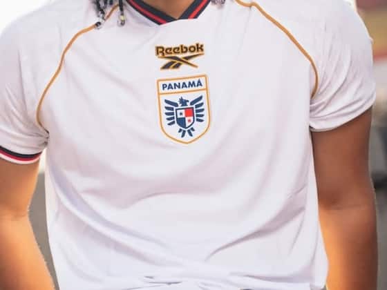
58. Panama away: Lacks flair compared to Panama’s third kit, which sadly isn’t included here.
57. Jordan home: A step up for Kelme, with subtle stripes and stylish shoulders.
56. Jordan away: Essentially the same as the home shirt, with reversed colours.
55. Tunisia home: Kappa’s return is decent — a solid effort.
54. Tunisia away: Equally reliable. Nothing groundbreaking.
53. Canada home: The maple leaf design is a bit of a gimmick, but we’ll allow it.
52. Cape Verde home: Bright, bold, and full of personality.
51. Croatia away: Slightly better than the home version, but still divisive.
50. England home: Traditional colours, fine detailing — a dependable choice.
49. South Korea away: The purple flower design divides opinion, but it’s daring and creative. We’ll call it middle-of-the-road.
48. New Zealand away: Symbolising “the four winds that bring the country together,” the design works nicely, though the black logo clashes slightly with the white fern.
47. Algeria away: Smart red detailing enhances a solid shirt.
46. Austria home: Bold, clean, and distinctly Austrian. A strong entry.
45. Belgium home: Feels classic and confidently Belgian. No complaints.
44. Qatar home: Funky pattern that works better than expected.
43. Ecuador home: Pleasant and balanced. Nothing flashy, just right.
42. Morocco away: Beautiful patterning, though the sleeves could use more detail.
41. Czechia home: A safe, well-made football shirt with a neat button feature.
40. Portugal home: Wavy and uncomplicated. It works.
39. South Africa home: Bright, vibrant, and distinctly representative of the nation.
38. Ivory Coast home: Orange done right — lively and stylish.
37. Czechia away: Gold is a bold choice, but it pays off. A classy look.
36. Iraq home: Jako delivers again with a confident design and strong visuals.
35. Germany away: The diamond pattern and sharp colour scheme make this a standout design.
34. Spain home: Not iconic, but solid. The yellow shoulder stripe ties it together nicely.
33. Brazil home: Classic simplicity. A nostalgic nod to 2002.
32. Colombia home: Inspired by magical realism, it’s rich in colour and design. Excellent execution.
31. Haiti home: The bold blue base and revolutionary artwork make this shirt powerful and meaningful. A cultural triumph.
30. Haiti away: Even better than the home version, with striking flag colours.
29. Panama home: A clean design with a classy collar — nicely done.
28. Portugal away: Polarising but intriguing. The waves and V-neck elevate the look.
27. Saudi Arabia away: Elegant and simple, with tasteful use of gold. A refined Adidas effort.
26. Algeria home: Cream tones and subtle patterns make this shirt beautifully understated.
25. Ghana away: Inspired by Accra’s Makola Market, this sunny design is full of life and colour.
24. Sweden away: A beautiful design that feels more South American than Nordic. Still, a winner.
23. Ivory Coast away: Initially divisive, now a favourite — bold, wild, and brilliant.
22. Morocco home: The best collar of the tournament. Period.
21. Senegal away: Stylish and vibrant. A fine Puma effort.
20. South Africa away: Another sharp Adidas design, though it gives off slight cricket vibes.
19. United States away: Black base with faint stars and red detailing — effortlessly cool.
18. United States home: Patriotic yet fresh. Stars and stripes done right.
17. Canada away: A shimmering constellation effect gives this shirt a unique glow.
16. DR Congo home: Umbro’s only World Cup kit, and it’s a gem — bold and intriguing.
15. Japan away: Playful pinstripes reminiscent of past favourites. A charming effort.
14. Norway home: Essentially a big flag, but it works. Erling Haaland will look majestic in it.
13. Scotland away: A gorgeous shade — salmon, coral, or terracotta — whatever it is, it’s delightful.
12. Ecuador away: Deep blue tones and a refined collar make this a classy Marathon creation.
11. Spain away: Simple, crisp, and elegant — like a Xavi pass.
10. Austria away: Watercolour textures and a hint of gold make this one of Puma’s best.
9. Iraq away: A stunning design from Jako — bold, balanced, and beautiful.
8. Uruguay home: Elegant and refined. A shirt worthy of fine dining — Darwin Núñez will shine in it.
7. Belgium away: Inspired by Belgium’s surrealist art movement — loud and brilliant.
6. France away: Mint green with subtle tricolour accents. Not typically French, but undeniably stylish.
5. Senegal home: Clean, modern, and effortlessly cool — a standout of the tournament.
4. Mexico home: A modern take on their classic Aztec theme, vibrant and full of character.
3. Germany home: A nostalgic nod to Italia 90 and USA 94. A timeless masterpiece.
2. Colombia away: Tropical, summery, and full of World Cup spirit — perfect for any celebration.
1. Curacao away: Perfection. The soft yellow, bold blue sleeves, retro Adidas logo, and elegant collar make this the undisputed king of World Cup 2026 shirts.
Thanks for reading! Share your thoughts — and disagreements — in the comments below.
-
Konaté signs with Real Madrid on a contract running until 2030, official announcement expected tomorrow

-
Yan Diomande expresses admiration for PSG amid Liverpool transfer links

-
From World Cup Controversy to Infamy: How Stefan Effenberg’s Defiance Ended His Bright Future with Germany

-
Marc Cucurella jokes about shaving his iconic curls if Spain clinch the 2026 World Cup title

-
Julian Nagelsmann Aims to Extend DFB’s Dream Run with a Subtle Nod Toward Said El Mala