The 2026 FIFA World Cup has arrived, bringing with it more teams, more matches, and—unfortunately—more questionable kits. With forty-eight nations participating, that’s a total of ninety-six different kits, not counting the goalkeepers’ and third options. In other words, there’s a lot of fabric to evaluate.
While we’re in the process of ranking all forty-eight home shirts, here’s a look at the ten most underwhelming kits that will feature on football’s biggest stage this year.
One of the kits attempts to represent the sea through wave patterns. Interesting idea, but poorly executed. A promising collar design has been completely lost due to a lack of attention to detail. The shirt’s dark red base hides the shape of the collar, while the green trim is barely noticeable. Simply reversing the colour balance—green dominant with red accents—would have given it far more character.
Also, using a ‘wave pattern to symbolise the sea’ isn’t exactly original. When clubs like Bournemouth have been doing it for years, a national team should really aim higher in 2026.
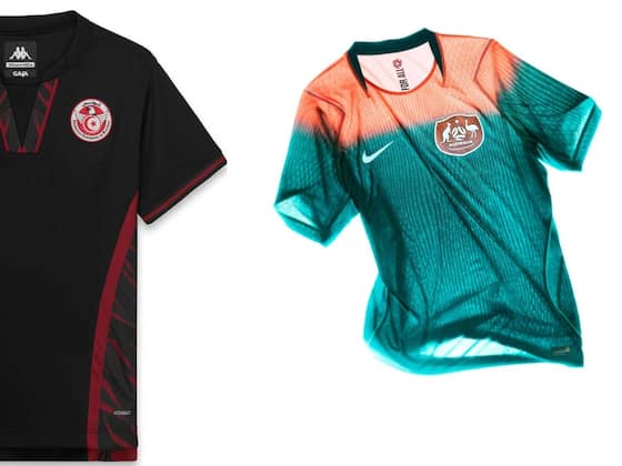
Including a third kit in this list might seem harsh, but we genuinely can’t understand what Kappa was thinking. Tunisia’s home and away kits both look elegant and cohesive, featuring the feather motif that represents the ‘Eagles of Carthage’. Yet the third kit breaks this unity entirely, replacing the smart collars with an unnecessarily complex design that feels more rugby league than football. The placement of the Kappa Omini logo and the national crest—tucked awkwardly under the armpit—makes matters worse.
Nike’s 2026 World Cup lineup is a mix of hits and misses. The United States kit firmly belongs in the latter category. It’s a loud, overly patriotic design that feels forced. While nodding to the 1994 version makes historical sense, the original was subtler and more balanced. The modern version, with its inconsistent horizontal stripes and off-white tones, looks muddied and awkward, especially once numbers are added. The away kit continues the same heavy-handed ‘stars and stripes’ theme. Subtlety clearly wasn’t the brief.
Bosnia’s away kit by Kelme also misses the mark. Their home kit already drew comparisons to bus seat upholstery, but the away version—white and blue—takes it further from football aesthetics entirely. It resembles generic sportswear, something more suited for tennis or table tennis than the World Cup. The overall look feels more Commonwealth Games than FIFA World Cup, and the fact that they’ll wear it in two of their three group games only adds to the disappointment.
Puma, whose recent World Cup record is mixed at best, delivers another letdown. Some of their 2026 designs are respectable, but this one is an uninspired, shapeless shirt with a dull round crew collar. The decision to triple up the Puma logo across the design feels arrogant given their inconsistent track record.
Then there’s the Netherlands. You’d think the combination of Nike and that legendary orange would be fail-proof, but the colour is just wrong—too fluorescent, too artificial. The crest and manufacturer logo are misaligned, a design sin that Nike should know better than to commit. The iridescent badge effect doesn’t help either; it’s a gimmick that belongs on an alternate or third kit, not the iconic Oranje home shirt.
All-black or all-white kits are another modern design trend that needs to stop. They’re presented as bold and minimalistic, but in reality, they’re just lazy. The all-black version feels hollow, devoid of imagination, and the identical white version isn’t worth discussing. It’s time for designers to move past this tired gimmick.
Another offender manages to be both bland and confusing. The colour palette is weak, the details unremarkable, and the inclusion of buttons on a football shirt feels misplaced. It’s the kind of outfit one might see at the Cambridge Boat Race rather than on a football pitch. The away version, ironically, looks far more striking—proof that the design team did have creativity, just not for the main kit.
Puma features again with yet another misfire. This red shirt somehow manages to be dull and overdesigned at the same time. The collar—part button-up, part fold-over—is messy, and the sleeve detailing adds unnecessary clutter. Even the single button looks awkward, giving the illusion of players wearing clip-on microphones.
Finally, we come to Australia’s away kit—the standout failure of the tournament. It tries so hard to be bold but ends up looking like a training top. The gradient fade between ‘Bright Spruce’ and ‘Orange Pulse’ feels more like a design experiment than a finished product. It’s neither daring nor stylish, just loud and forgettable. Despite its attempt to be eye-catching, it completely misses the mark, ending up more like pre-match warm-up wear than a World Cup kit. A genuine embarrassment for a football nation that usually nails its aesthetic.
In summary, the 2026 World Cup offers its fair share of visual highs and lows, but these ten designs remind us that bigger doesn’t always mean better. Sometimes, even on the grandest stage, the simplest missteps can lead to the most spectacular fashion failures.
-
Beyond Saibari: FC Bayern eye another PSV Eindhoven standout

-
Atletico Madrid anticipate Arsenal’s bid for Julian Alvarez amid Barcelona block

-
Bernardo Silva delivers clear response to Atletico Madrid: ‘Barcelona is my priority’

-
Steven Gerrard used as reference to explain why Arsenal star Declan Rice is not a Ballon d’Or contender yet

-
Harry Redknapp Exclusive: England’s Defence Lacks Stability, But World Cup Dreams Still Alive