The 2026 FIFA World Cup kicks off this month, and with it comes the excitement, drama, and fashion of football’s grandest stage. It’s time to set aside the doubts and controversies and simply embrace the joy of the tournament.
Yes, there are always concerns – questionable host selections, the occasional over-commercialisation, and changes that make traditionalists cringe. Yet, despite everything, the World Cup remains a spectacle unlike any other, a celebration that belongs to the fans and the game itself. No matter how hard organisers may try, they can never fully take that away.
Beyond the football, the World Cup is also a runway for kit culture. With the tournament expanding to 48 teams, it’s a paradise for kit enthusiasts. More nations mean more designs to critique, admire, or downright despise – and that’s half the fun.
To handle the sheer volume, we’ve divided our all-encompassing ranking of every home kit being showcased across North America into four parts. Naturally, we begin from the bottom – positions 48 to 37 – and even at this early stage, some major footballing nations make an appearance.
Let’s start with what might be the least “football-like” shirt of the entire tournament. It’s devoid of any standout detail – the colour is uninspired, the trim is forgettable, and the overall effect is painfully bland. Buttons on a football shirt rarely work, and this one confirms why: it looks more like casual wear than matchday attire. A proper crossover v-neck would have done wonders here.
The overall aesthetic feels more suited to the Cambridge Boat Race team celebrating victory on the Thames than a World Cup side. It’s puzzling and misplaced, and while the away kit redeems things slightly with a bolder design, the home version remains disappointing.
Puma’s record with recent tournament kits has been inconsistent, and this latest red design continues that trend. It manages to be both dull and overly fussy, with a confusing dual-collar arrangement and awkward sleeve detailing. The unnecessary button at the top looks misplaced, almost as if players are wearing clip-on microphones. Some better Puma efforts appear later in the list, but this one falls flat.
On the other hand, some Puma kits err in the opposite direction – shapeless, baggy, and lacking definition. The brand’s decision to place its cat logo three times across several designs this year feels excessive and self-indulgent.
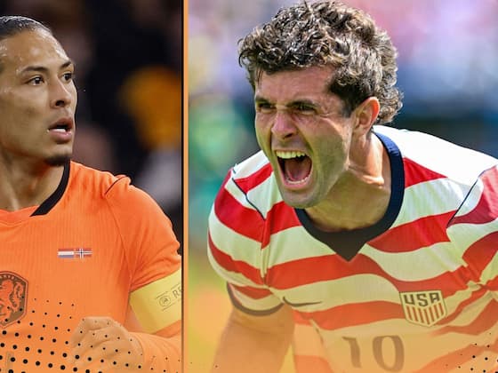
Turning to Nike, one of the most disappointing efforts comes from the Netherlands. With such an iconic colour palette, it’s baffling how this design misfires. The orange is strangely fluorescent – more neon highlighter than classic Dutch orange – and the imbalance created by a centred crest and offset manufacturer logo ruins the symmetry. The iridescent effect on the badges doesn’t help either, feeling gimmicky and more suitable for an alternate kit than the main one.
It’s important to remember the context in which these designs exist. Adidas, Nike, and Puma dominate the market, supplying around three-quarters of all teams between them. Smaller brands like Kelme, Kappa, Marathon, and Umbro have to compete with limited resources, so we try to be fair to them. Even so, Kelme’s design here disappoints, feeling more like something fit for a Commonwealth Games badminton team than a World Cup football side.
Another Nike entry that misses the mark is the USA’s home kit. With clear nods to the 1994 design, it attempts to blend nostalgia with national symbolism but ends up feeling overworked. The horizontal stripe pattern looks cluttered, and the off-white tones lend an unintentional griminess. Once player numbers are added, the design becomes even busier. The away kit continues the flag-inspired theme but doesn’t offer much relief from the overbearing patriotism.
Elsewhere, one Puma kit features wave patterns meant to symbolise the sea – an interesting idea that falters in execution. A better use of colour contrast on the collar and cuffs could have elevated the design significantly. As it stands, the effect is muted and uninspired, especially compared to similar efforts seen in club football years ago.
For the defending champions Argentina, Adidas’s approach has been surprisingly poor this year. The brand’s decision to enlarge its three stripes across all 2026 designs has backfired dramatically. The iconic three-stripe motif works best when sleek and balanced, not oversized and cramped. This misstep mars nearly every Adidas home kit at the tournament.
The Argentina kit, in particular, suffers from unnecessary experimentation. The sky-blue stripes – one of the most recognisable visuals in football – are muddled with multiple shades, disrupting the classic aesthetic. It’s a case of fixing what wasn’t broken. The away kit, however, redeems things somewhat with a cleaner and bolder execution.
Adidas’s misjudged stripe design also affects other nations like Algeria, whose understated kit fails to escape the distraction of those chunky shoulder lines. Even when the base design is elegant, the stripe proportions ruin the effect. Similarly, another Adidas effort with white oversized stripes draws even more unwanted attention to the problem.
As a result, many potentially great kits end up being merely average or worse. The situation is frustrating because several designs could have been instant classics had the stripes been left untouched. Instead, fans are left wondering why the simplest part of Adidas’s identity has been so drastically altered.
Kelme’s Bosnia kit brings a different kind of misfire – an overly patterned design reminiscent of a coach seat cover rather than a football shirt. It’s an ambitious attempt that ends up visually chaotic.
And then there’s Switzerland. Year after year, they deliver the same safe Puma template. It’s serviceable but instantly forgettable, unchanged from Euro 2024 or Qatar 2022. A supposed “glow in the dark” feature adds no real value – a gimmick masking repetition. Switzerland’s kit consistency might be admirable in one sense, but at this point, it’s just dull predictability.
So there you have it – the bottom twelve kits of the 2026 FIFA World Cup rankings. Some bland, some baffling, and some that simply fail to live up to their potential. But if history has shown us anything, there’s always redemption waiting in the next batch.
-
Anushka Sharma again dominated the IPL finals, wore an expensive outfit worth more than Rs 25 thousand, Tulsi rosary around her neck won hearts

-
Bread Rasmalai: Instantly prepare Bread Rasmalai at home in 15 minutes; Learn the easy recipe

-
Google Drive gets smarter document scanner with AI features and multi-page support

-
Big action in ICC board meeting, ban imposed on this country, approval for pink ball trial in test cricket

-
Premier League record-breaker James Milner retires