
It is 3 pm, your brain feels foggy and your eyes are heavy. While many blame poor sleep or demanding workloads, the colour of your office walls might be quietly draining your energy throughout the day. According to experts, the answer lies in understanding the “Green-Refractory Period”, the phenomenon where our eyes process green wavelengths with minimal muscular effort.
According to a , “Green-dominant visual environments were associated with lower levels of visual fatigue and reduced accommodative strain compared to high-brightness or blue-dominant backgrounds.” It confirms that green tones reduce eye strain during screen work and supports the idea behind the “Green-Refractory” concept or the lower visual effort.
In an interview with the Times of India, Dr Eleni Nicolaou, Art Therapist and Creative Wellness Expert at Davincified, a platform offering therapeutic paint-by-numbers experiences, shared, “The human eye can focus on green with the least amount of strain, providing passive rest for the optic nerve while we work.”
Read on as we outline why muted greens could transform your workday and is the antidote to “3 pm burnout”.
Combating digital eye strain
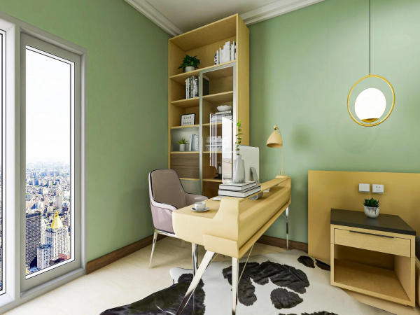
Cool blues and stark whites dominate office design but these colours may be working against you. Blue is calming but when paired with screens , it can contribute to digital eye strain. White walls reflect blue light from monitors, effectively doubling the glare your eyes must process throughout the day.

“Muted greens absorb light rather than reflect it,” said Dr Nicolaou. “This reduces the contrast between your monitor and the background, preventing what we call ‘visual fatigue’, that heavy, strained feeling in your eyes by mid-afternoon.”
The reduced contrast means your eyes do not constantly readjust between the bright screen and surrounding walls, preserving your energy for the work itself rather than burning it on visual processing.
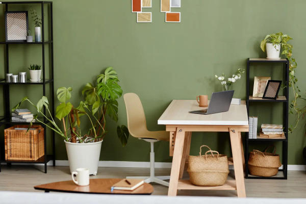
The Biophilic anchor
There is a psychological reason why “leaf-tones” feel inherently calming. Our brains associate these shades with safety, abundance and environments where resources are plentiful and threats are minimal.
“Being surrounded by forest green lowers heart rate and cortisol levels,” Dr Nicolaou explained. “It keeps the fight-or-flight response at bay during high-stress meetings or tight deadlines. Your nervous system reads these colours as signals that you're in a safe, nourishing environment.”
A revealed, “Exposure to green hues and nature-associated colours in indoor environments significantly reduced stress markers, including heart rate and cortisol levels.” It validates claims that green environments calm the nervous system and supports the “biophilic anchor” argument.
This biophilic connection is deeply wired into our evolutionary biology, making green uniquely suited to creating calm, focused workspaces.
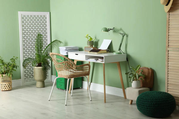
The creativity vs productivity balance
Not all greens serve the same purpose. Sage green promotes high-level creative thinking, which is ideal for brainstorming sessions or strategic planning. Forest green, by contrast, encourages deep, concentrated “flow” states where complex tasks feel manageable.
Authors of a , widely cited in 2026 workplace research, noted, “Natural colour palettes, particularly greens, enhanced sustained attention and task performance compared to neutral or high-contrast environments.” It asserts that green improves focus and productivity and reinforces the differences between calming vs stimulating colour environments.
“If your work requires sustained analytical thinking, forest green provides the grounding you need,” says Dr Nicolaou. “For creative professionals who need to generate ideas, sage offers the lightness that sparks innovation.”
The sheen and LRV factor
Paint finish matters as much as colour. “Opt for a chalky matte finish for home offices,” recommended Dr Nicolaou. “Any gloss or satin sheen on dark green creates ‘specular reflection,’ or hot spots of light that force your eyes to readjust constantly. This defeats the entire purpose of choosing a calming colour. A matte finish with a low Light Reflectance Value absorbs light evenly, maintaining the visual rest your eyes need throughout the day.”
The too established that incorporating natural colours like green in offices “supports visual comfort, wellbeing and sustained productivity.”
Dr Eleni Nicolaou revealed, “The connection between our environment and mental state is profound. Green is aesthetically pleasing and neurologically restorative as well. When we surround ourselves with these tones, we're giving our visual system a break from the constant strain of modern screen work. The key is understanding that small changes, like paint colour and finish, can have measurable effects on our daily energy levels. It's about creating a workspace that supports sustained focus rather than depleting it hour by hour.”
-
Suryakumar Yadav Becomes 3rd Cricketer To Hit 150 Sixes For Mumbai Indians

-
IPL 2026 [WATCH]: Tilak Varma’s spectacular catch on the boundary line removes Vaibhav Suryavanshi during RR vs MI clash

-
Understanding the Qualities of a Good Bride According to Hindu Traditions

-
Asian Markets Surge Following Ceasefire and Oil Price Drop

-
Sacking of Waitrose worker is a 'charter for all thieves to conduct a supermarket sweep'